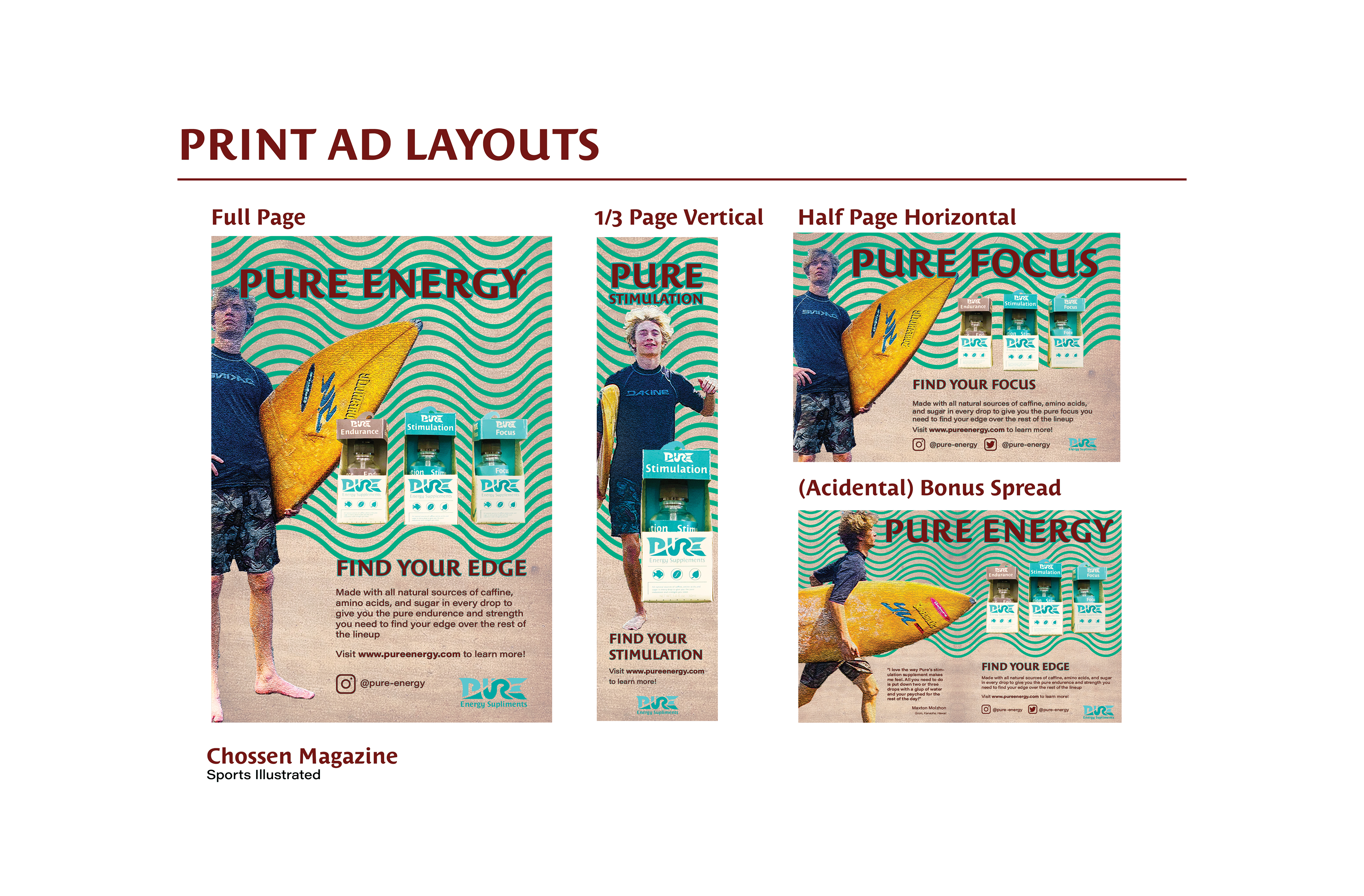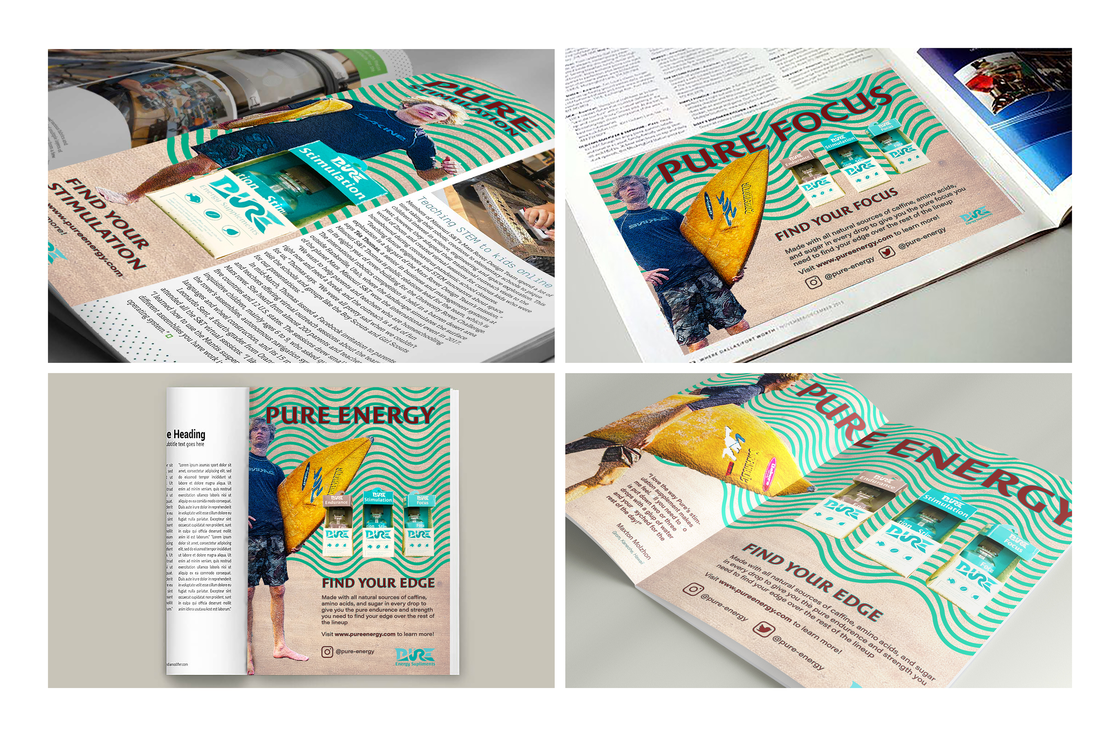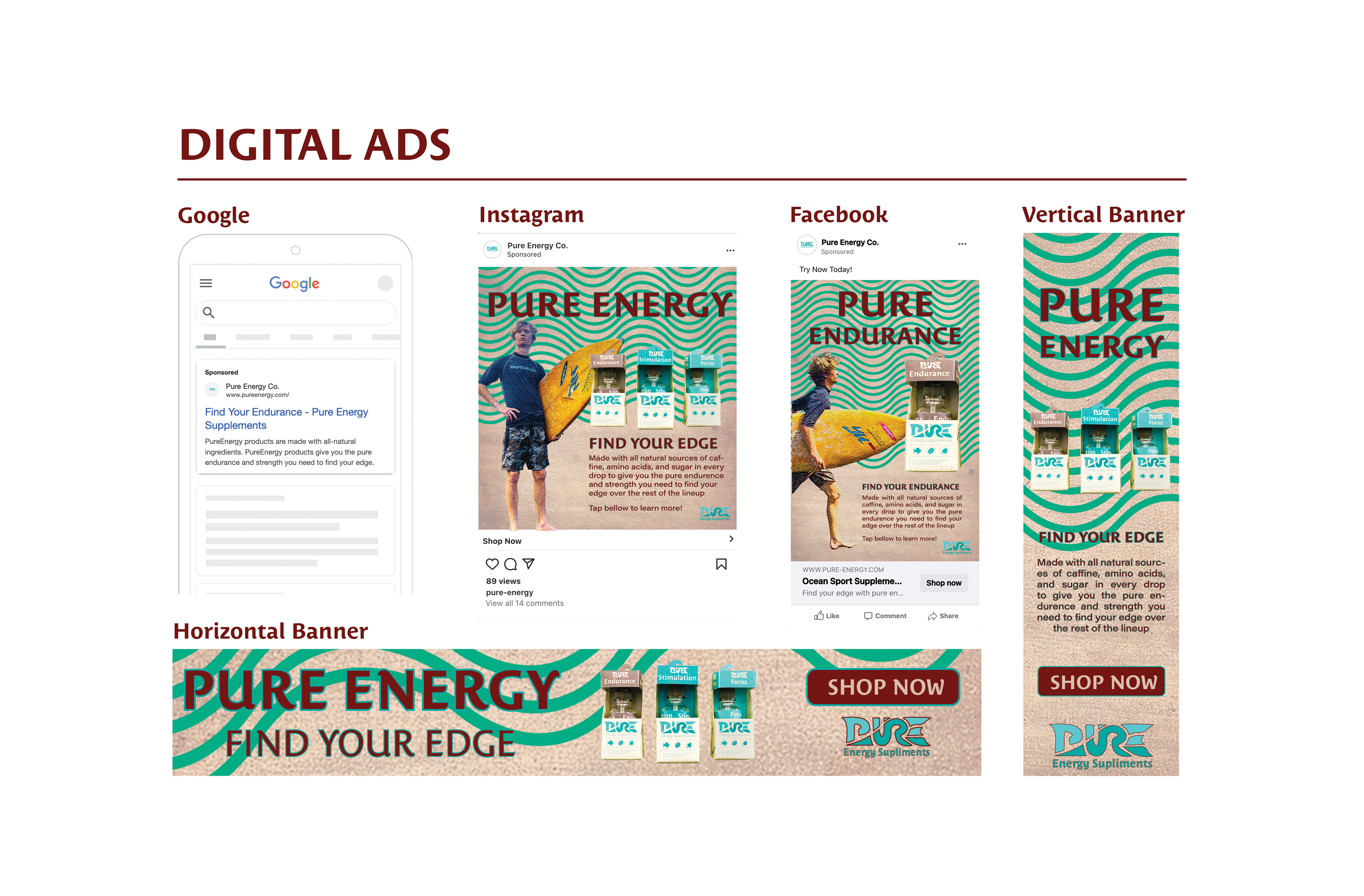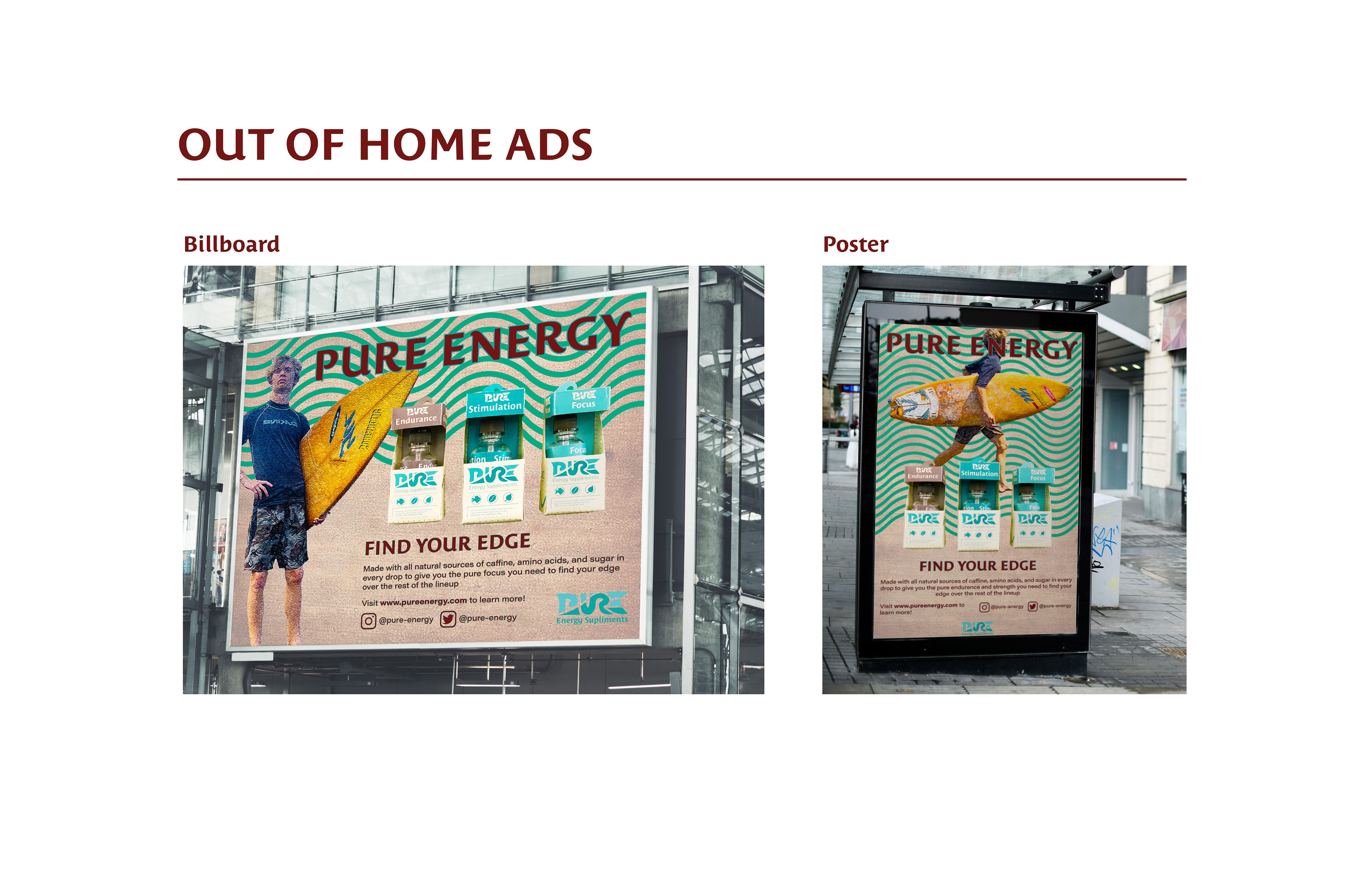
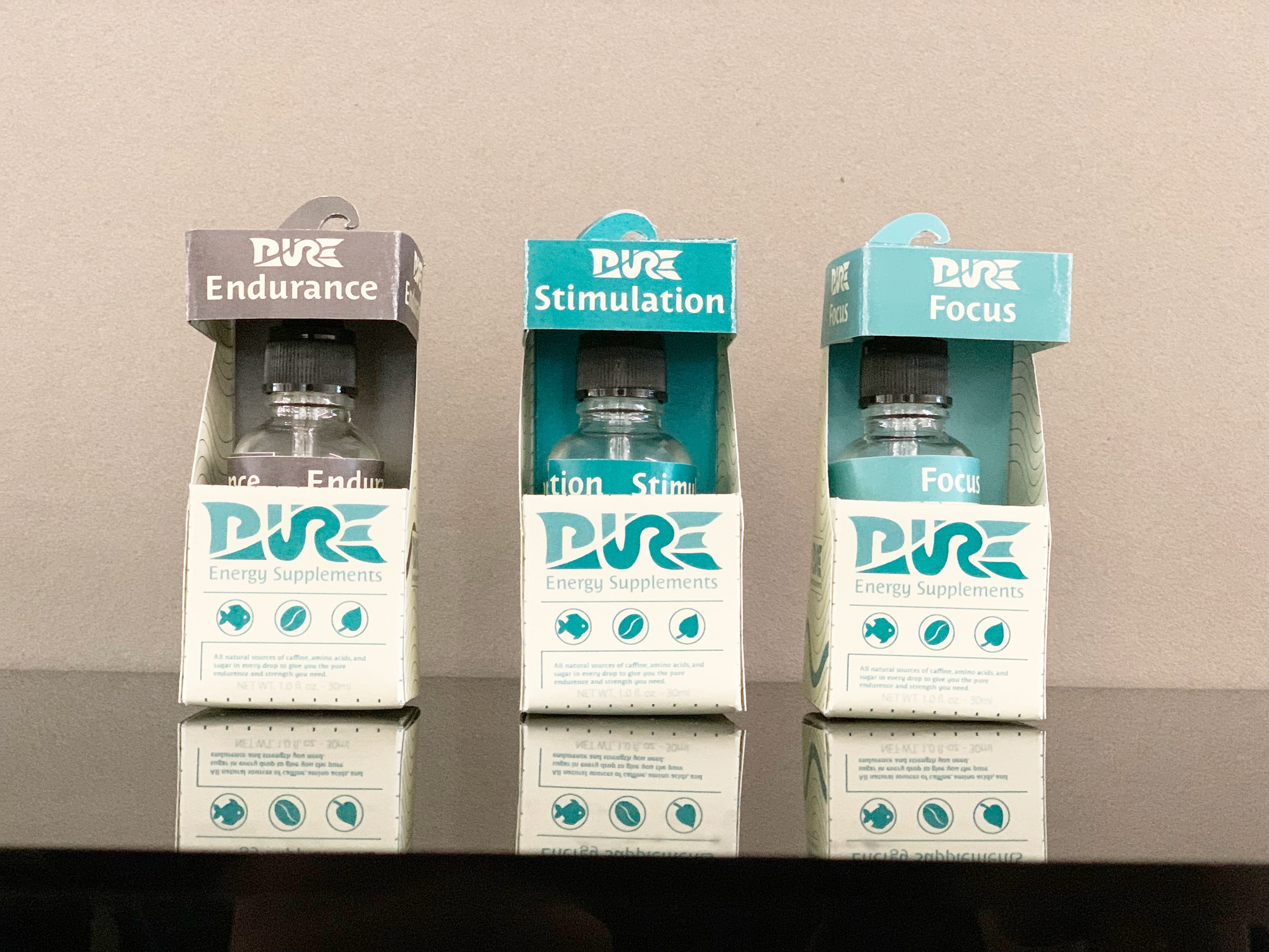
PROJECT GOAL
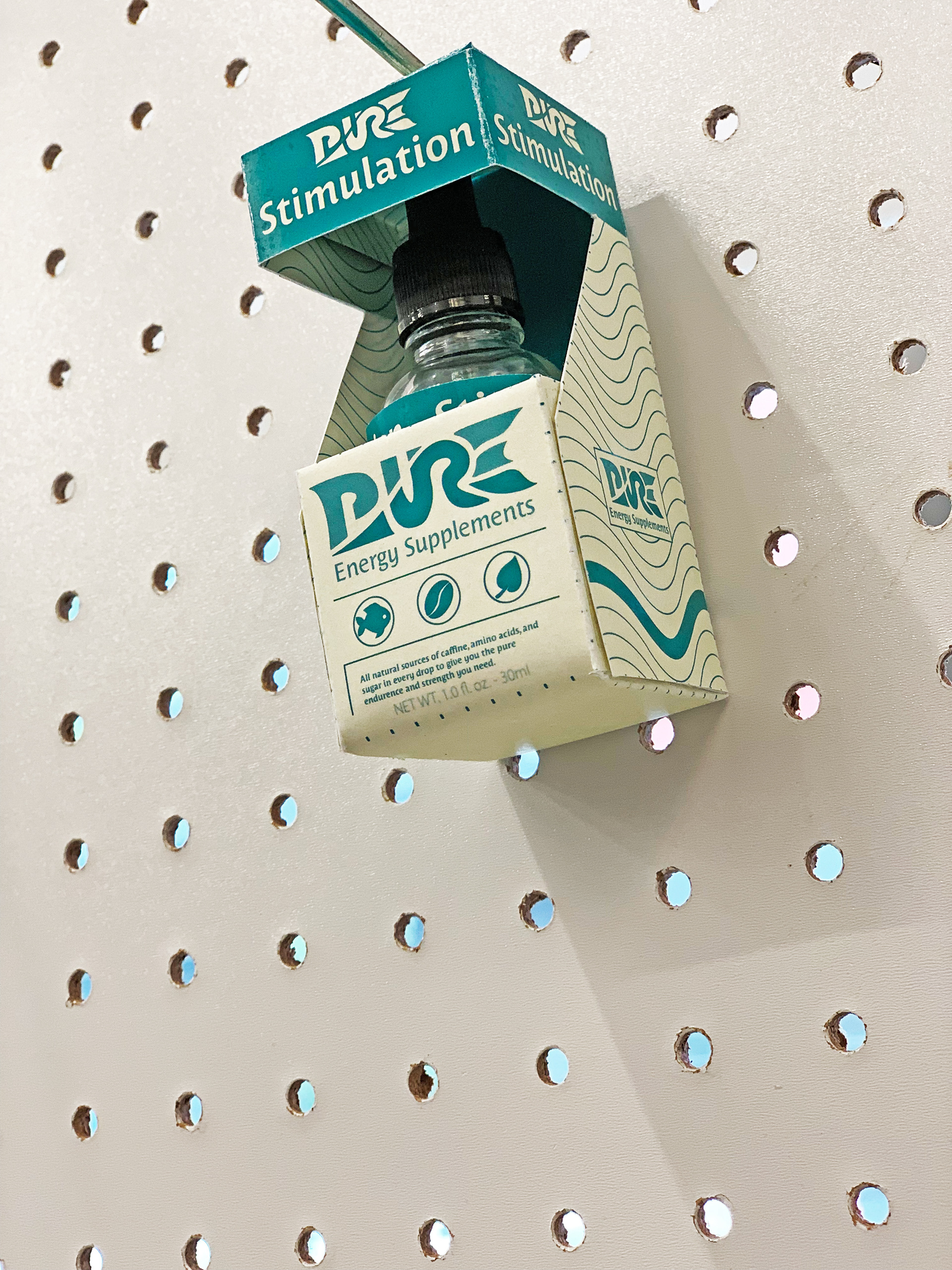
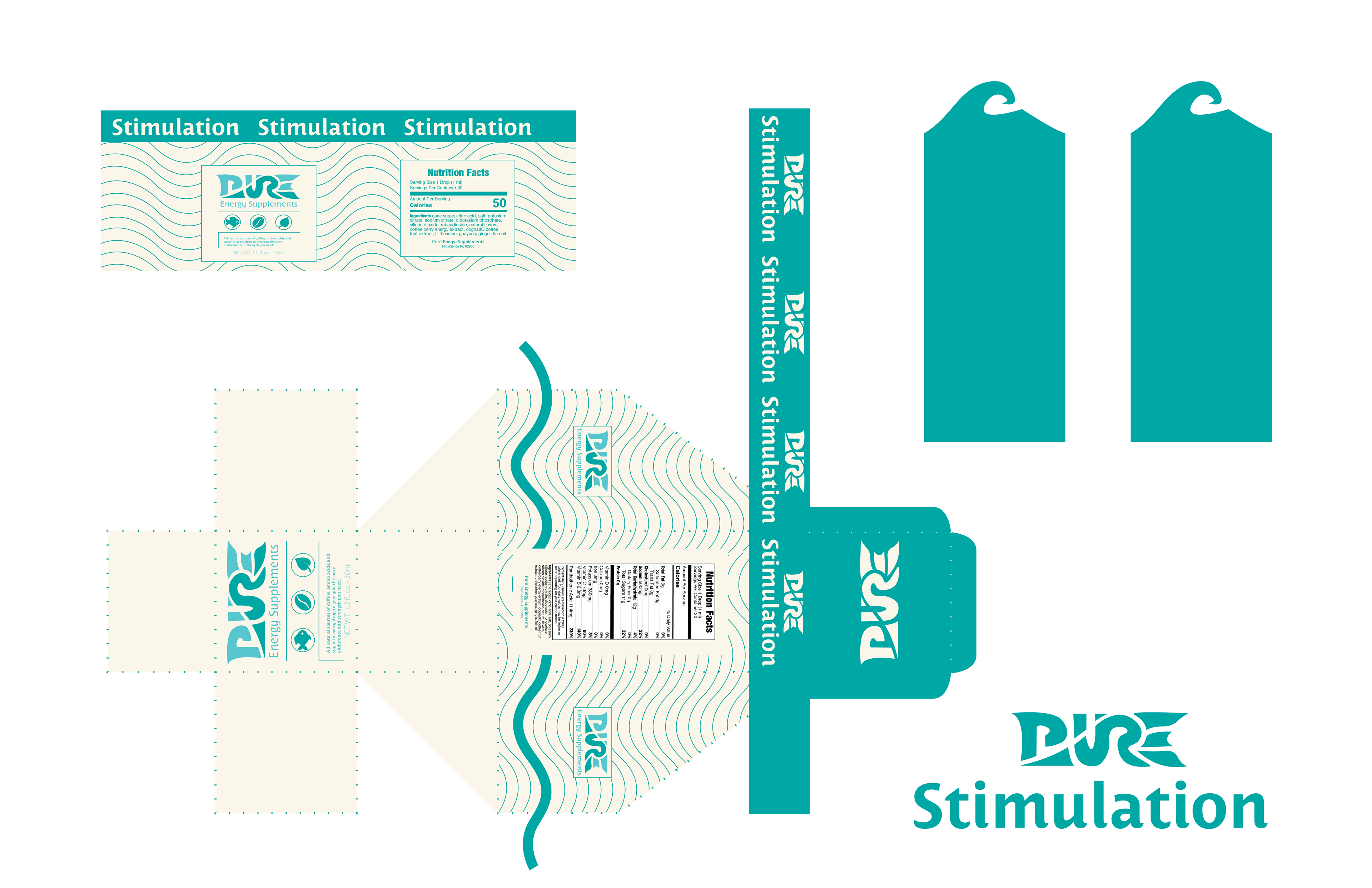
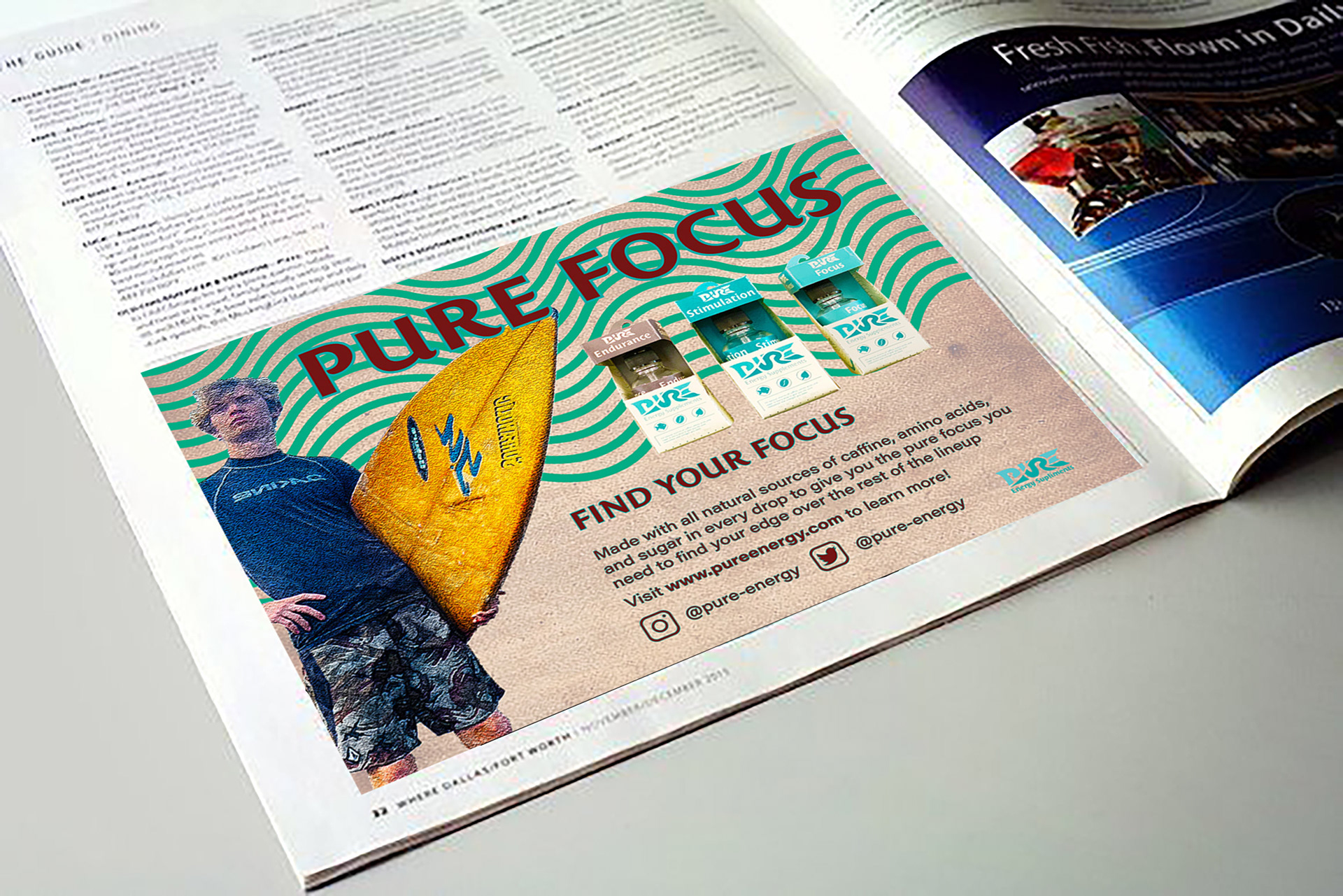
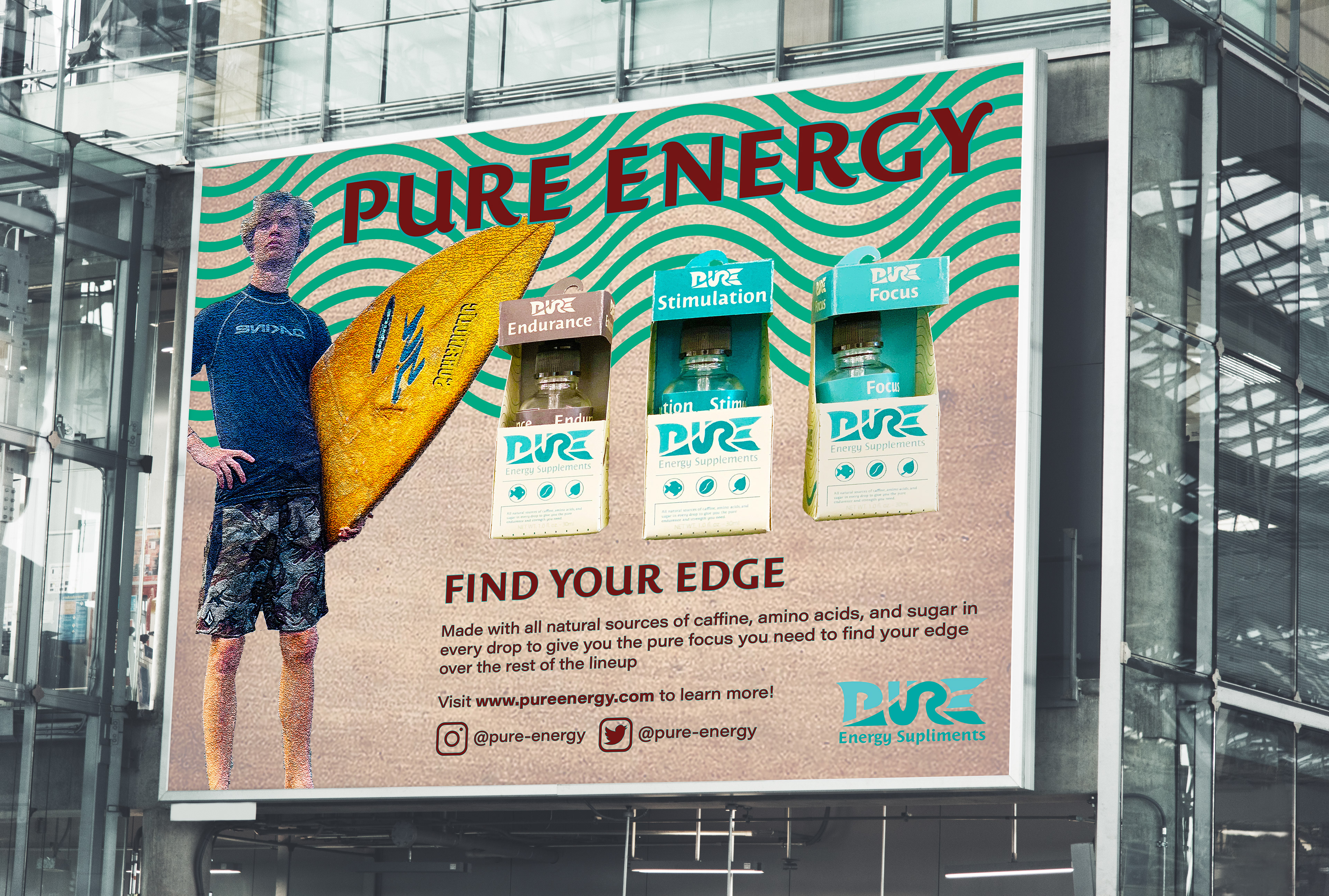
This project challenged me to design a cohesive packaging system and integrated marketing campaign for Pure Energy, a hypothetical ocean sports supplement brand. The goal was to create a hanger tab packaging system that distinguishes three different products through subtle graphic variations while establishing a bold visual identity that marries an oceanic vibe with a grungy, vintage action sports aesthetic.
Design Tools
Pen & Pad
Exact-O
Adobe Illustrator
Adobe Photoshop
Adobe Indesign
Skills Used
Brand Identity
Packaging
Editorial/Publication
Image Editing
CONCEPT
Inspired by the ocean’s natural palette, I developed a neutral, ocean-toned color scheme and integrated subtle wave-like line graphics throughout the design. A trademark wave motif emerged, shaping both the logo and the unique hanger tab design. To add vibrancy, I introduced a bold maroon accent for headers, which contrasted dynamically with the original blue hues. The integrated campaign was executed across 12 deliverables—ranging from social media and web ads to out-of-home and magazine placements—each carefully tailored to showcase the cognitive benefits of the individual products through responsive advertising and striking imagery.